
There is an abundance of paper options out there to choose from and it can sometimes be challenging to decide which paper would produce the best results for your print. Undoubtedly the best option is to find a way to view the different papers in person so you can better appreciate the weight, texture and tone of the paper, but of course this may not always be possible.
In this article we’ll walk through some of the key components that make-up various fine art papers. As always, if you need any advice – please don’t hesitate to get in touch.
Types of paper
At Fine Art Printing we are focused on stocking the highest quality papers and canvases from Hahnemühle, a German paper producer that has been in the trade since 1584. We offer two paper types:
- Those made from cotton rag
- Those made from Alpha-cellulose
Let’s touch on each of these types of papers in slightly more detail.
Cotton Rag Papers
As the name would suggest, cotton rag papers are made from either cotton or a percentage of cotton combined with other materials. As an example, the Hahnemühle Photo Rag 308 is made from 100% cotton, whilst the Hahnemühle Bamboo is made from 10% cotton and 90% bamboo fibres. These types of papers provide exceptional results for art printing as the texture of the paper combined with giclee printing [12-colours] is able to produce an almost original artwork look and feel.
Cotton rag papers are also typically very durable and have excellent age resistance.
Alpha-Cellulose Papers
Alpha-Cellulose refers to papers that are made from a high grade wood pulp. These papers have been refined to remove the acid and lignin to ensure they are able to meet strict standards for durability and age resistance. An example of an Alpha-cellulose paper would be the Hahnemühle German Etching, which is a high textured matte paper and produces amazing artwork reproductions.
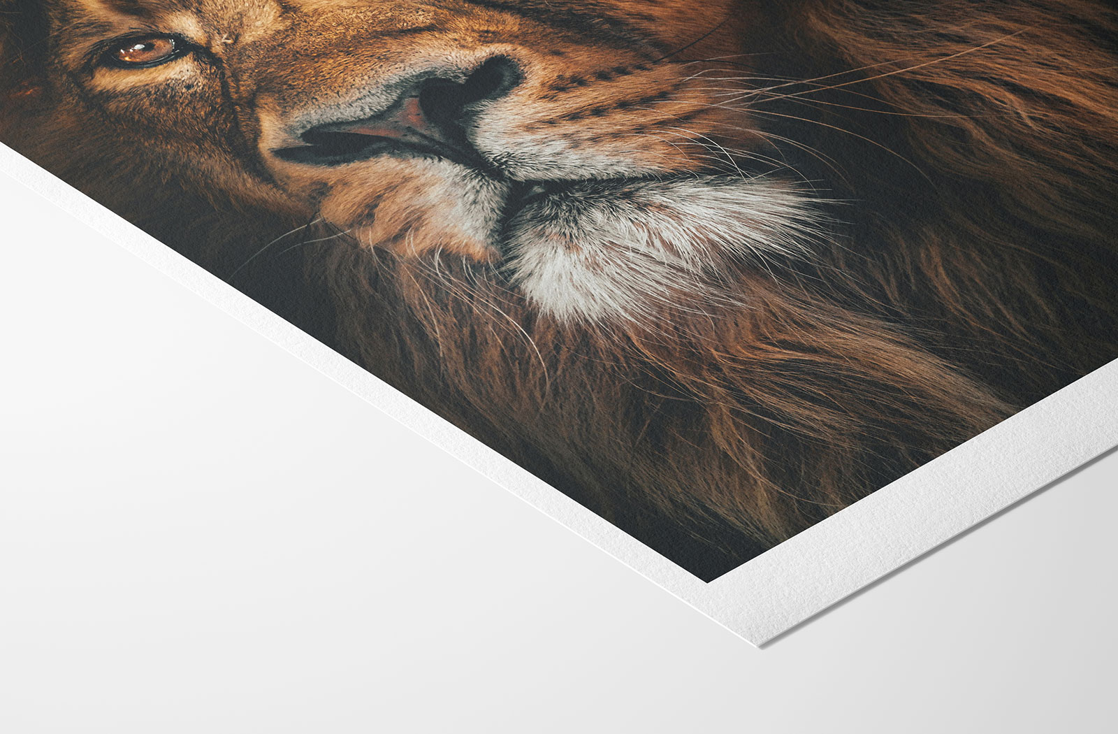
Alpha-cellulose papers are typically slightly less expensive than cotton rag papers, but the quality and output is not necessarily inferior. The below image is a close-up of the highly textured finish on the Hahnemühle German Etching paper made from 100% Alpha-cellulose.
Weight of paper
Another key component of fine art papers is the weight, which is measured in gsm or ‘grams per square meter’. Generally speaking we recommend a weight of between 280 – 310gsm for fine art printing. This gives you that durability and premium feel whilst making it suitable for easy mounting.
Below is a general guide to different paper weights for reference:
60 – 100gsm – the standard paper weight for most household printers – think of your typical A4 sheet of paper.
110 – 140gsm – typically used for mass produced posters. Often laminated to give them extra strength and protection as they aren’t overly sturdy without.
170 – 240gsm – could also be used for posters, but still on the light side for fine art production.
250 – 310gsm – around the perfect weight for fine art print productions. Premium feel, nice and sturdy, great for mounting inside frames.
320gsm+ – thicker weight that is perhaps more suitable for premium greeting cards or invitations than art printing.
Texture of paper
The texture of the paper is arguably one of the most subjective elements when deciding which paper to choose. If we were to print the exact same artwork on Hahnemühle Photo Rag, German Etching or Bamboo, you may even struggle to accurately call out the differences without being able to touch and feel the finish. Once the paper goes behind acrylic or glass, the differences may be extremely subtle.
Every customer has slightly different viewpoints depending on their preferences and circumstances. For example, a customer who is purchasing prints to sell to others may favour a smooth cotton rag paper to provide that “premium feel”. Another customer might choose a highly textured paper purely on the basis that they feel a textured paper is more appropriate for an old artwork reproduction. There is not really a right or wrong decision here and we are happy to give some guidance based on your requirements.
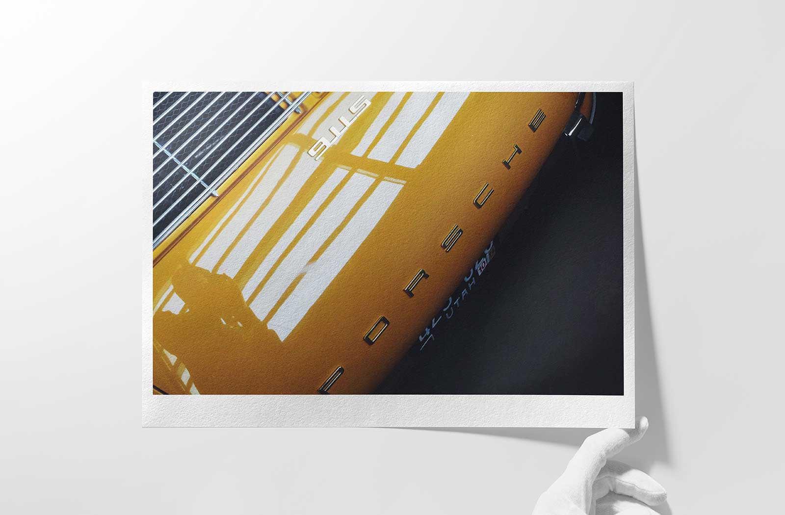
The photo below is the Hahnemühle Photo Rag. This is a smooth matt paper, but as you can see there is some slight texture visible.
The finish of the paper
Similar to the texture of the paper, the finish is also highly subjective. We generally stock fine art papers with either a matte or pearl finish as we find these to be the most popular options whilst producing the best results.
Matte finish
The majority of fine art papers are matt finish. They can have a smooth or textured surface, but they feel natural and don’t have any sheen, which ensures they don’t give off any light reflection. Due to the nature of fine art papers even those defined as having a smooth finish will have some elements of texture when handled compared to a pearl or glossy paper.
Matte finish papers are great for any type of print – whether its a family photograph, a photo of a forest landscape, or some reproduction of an original piece of art, you generally can’t go wrong. When comparing a matte paper to a pearl or glossy paper, the main thing we would highlight is that matte papers may produce slightly less vibrant colours.
There is definitely images [typically photographs that contain vibrant colours] that just pop much more when combined with a pearl or gloss finish paper. If you aren’t quite sure which is most suitable for your image, please get in touch and we’ll be happy to guide you.
Pearl, Satin or Lustre finish
There is subtle differences between pearl, satin and lustre finishes. All are very similar, but satin is often a touch more shiny in general compared to the pearl [its often called semi-gloss]. These papers are a nice middle-ground between a matt and glossy paper. They are really resistant to fingerprints and glare when compared to glossy paper but still produce exceptional colour vibrancy.
We usually recommend this finish whenever a customer is looking to print a photograph with vibrant colours but is concerned about glare or other end customers potentially mis-handling the prints later down the road.
The Hahnemühle FineArt Pearl is one of our most popular papers for clients looking for that extra vibrancy without high-sheen.
Glossy finish
Glossy papers are generally very smooth and have a highly reflective surface. They are a good option for producing high contrast prints with vibrant colours, but we generally prefer to leverage a pearl finished paper to reduce the overall glare. Generally we also find that glossy papers are less resistant to fingerprints compared to pearl papers which can be a challenge if you think people may be handling your prints [i.e., if you are selling to other end customers and are concerned about them mishandling the work on delivery].
Metallic finish
Metallic finish papers have a rather distinctive glossy finish and can be a good choice for photographs containing metallic elements, reflections, glass, and architecture. They are also quite popular for black and white photographs with high-contrast tones. Much like the pearl finish paper, metallic paper is quite durable and resistant to fingerprints when compared to glossy paper so it can be a good choice if you are printing with the intent of selling your prints to others.
We currently stock Hahnemühle Metallic Photo Rag® and Hahnemühle Metallic Canvas that provide this metallic finish.
Paper Tone
The last component we’ll cover is the paper tone. You will generally find paper tone described in terms such as natural white, bright white, off white, warm white and so forth. Papers with a more natural or warm white tone will typically be more of a creamy tone whilst bright white will be show a more pronounced white finish.
Sometimes the paper tone will not play a major part in the print output. If you are printing an artwork with a visible white border around the edges, you may be more selective over the tone of the paper as this will show more visibly on your final print.
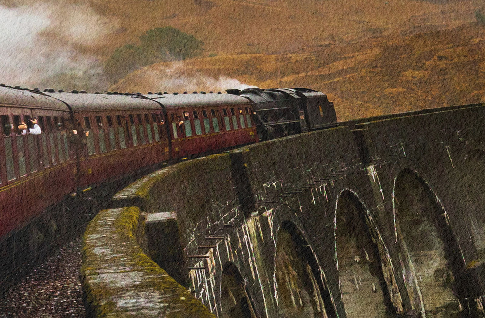
Generally natural white, off white, warm white type tones work better for prints that are using yellow or lighter tones in general. This is because lighter tones may be ever so slightly overpowered by a bright white paper. We’d also tend to recommend natural white -> warm white papers for images of natural settings such as a forest or mountain range as the colours themselves appear more natural.
Papers that are bright white tend to produce a little more vibrancy in the colours but also work well for high-contrast black and white photographs.